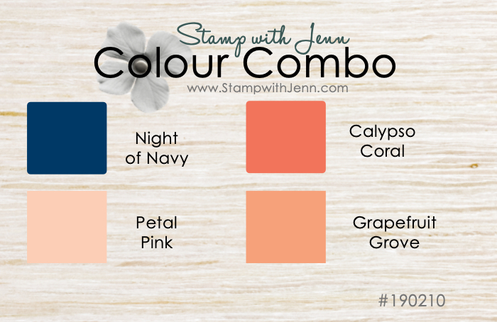
What Goes with Stampin’ Up’s Grapefruit Grove?
Grapefruit Grove is one of the Stampin’ Up!’s 2018-2020 ‘In Colors’ . This is a lovely soft peachy colour that is available until May 2020. The colour comes in ink, paper, cardstock, makers, embossing powder and some embellishements. When I see the new ‘In Colors’ I always like to look at them against the other Stampin’ Up! colours. The ‘In Colors’ are around for 2 years so I like to know how I’m going to use them. You can see in this post when these colours first came out, so you can see how I compared Grapefruit Grove to the other colours from Stampin’ Up! in a cute little flower chart format. See my colour scheme for this card below.
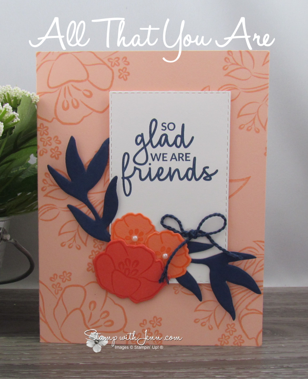
I got this adorable card in a demonstrator card swap. Demonstrators swap cards to get ideas from each other and get samples for our business. I was excited when I got this card swap, because it uses one of my favourite stamp sets from the Stampin’ Up! Occasions Catalogue, All That You Are. (See all the Stampin’ Up! current catalogues here).
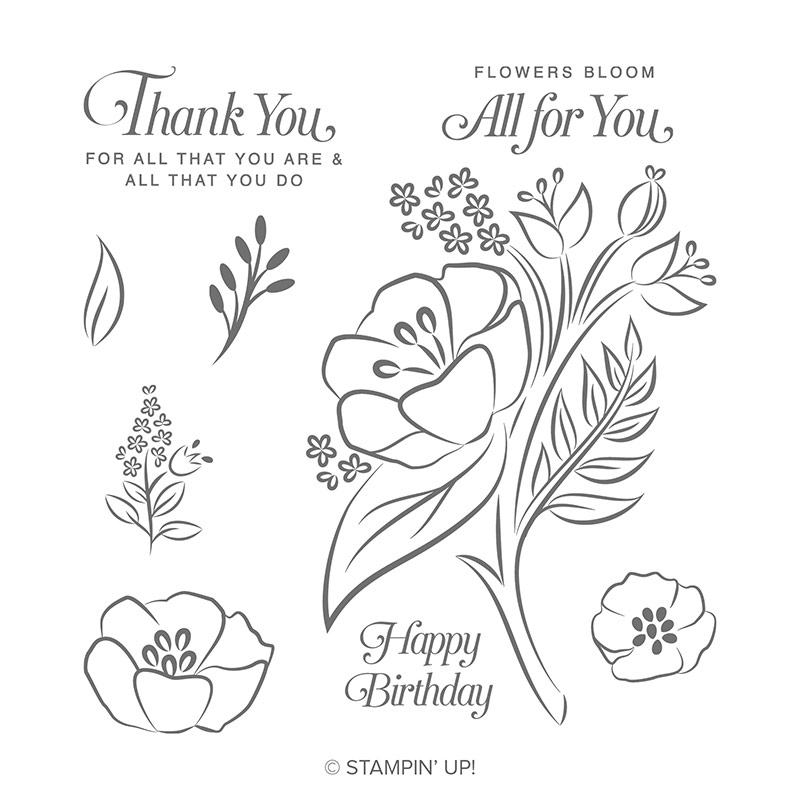
The All That You are stamp set has some pretty flower and sayings. And two of the flowers are can be cut out with the Frosted Bouquet Framelits. Yes, these are the same Framelits dies that cut out the images from the First Frost stamp set (that came out in the Stampin’ Up! Holiday Catalogue). In fact, both the Frosted Bouquet Framelits and the First Frost stamp set are STILL available to purchase. You won’t find them in any catalogues, but you can see the full list of what is still available in my Online Store here (under Holiday Favourites). I love that when Stampin’ Up! makes dies that match more than one stamp set.
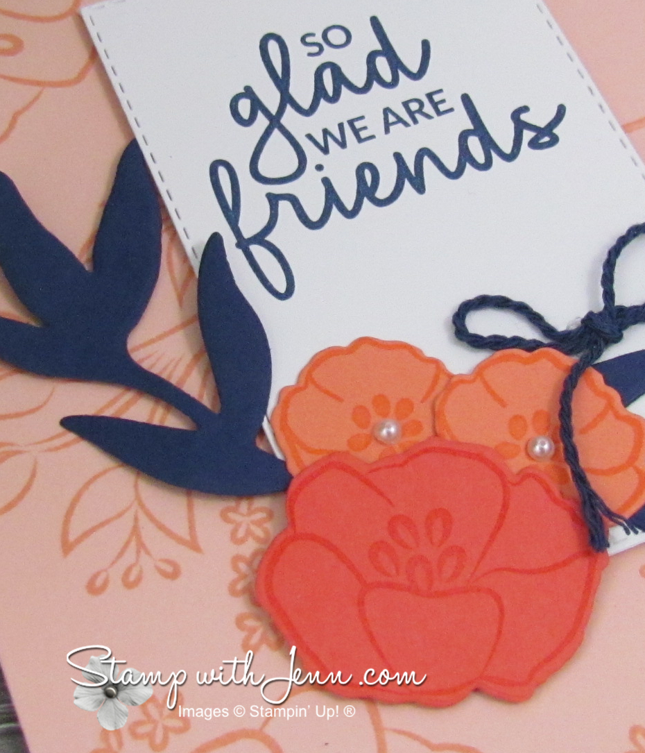
The colour scheme on this card comes from the principal that oranges and blues are complementary colours on a colour wheel. These colours sit directly across from each other on a colour wheel like blue and orange or green and red. Complementary colour schemes are ones that really pop against each other, like on this card. The dark Night of Navy colour really stands out against the lighter orange tone of Grapefruit Grove, Calypso Coral, and even Petal Pink (more of a peachy pink).
I really love how fresh and vibrant this colour scheme is! I can see myself using it again! And you might have noticed that in the Stampin’ Up! Occasions catalogue that the sample next to the All That You Are stamp set, is no only a similar layout to this card, but also a similar colour scheme. You can see that in the first picture below.
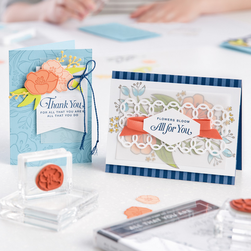 In this case, the blue and orange colour combination is reversed. The blue is the main colour and the oranges are the accents.
You can see the full list the of the supplies on this card at the end of the post and you can click on any of the images below to go to my Online Store.
I hope you’ll give this colour scheme a try. If you don’t have an Occasions Catalogue yet, please let me know, and I’m happy to get you one!