Comparing the New Stampin’ Up! ‘In Colors’
 Each new annual Catalogue that Stampin’ Up! releases has five new ‘In-Colors’ in it. These are trendy colours that help augment Stampin’ Up’s four permanent colour collections. And good news: these colours are available for two full years: from June 2017 to May 2019. That means you can safely buy the inks, ink refills, cardstock and matching accessories for a good long time. And that is a good thing because we always fall in love with the new colours. I’m still trying to decide what my favourite new colour is. I love the Berry Burst and Fresh Fig, but then again, I am a purple girl and the Lemon Lime Twist is so fun and very trendy right now. Do you have a favourite?
You can see all the colours together on this sneak peek card I posted here.
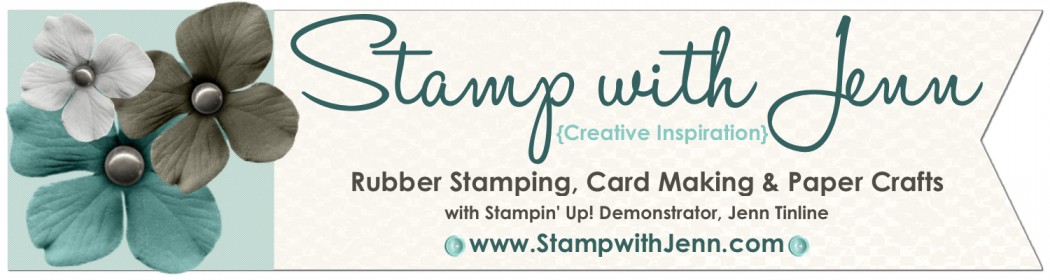
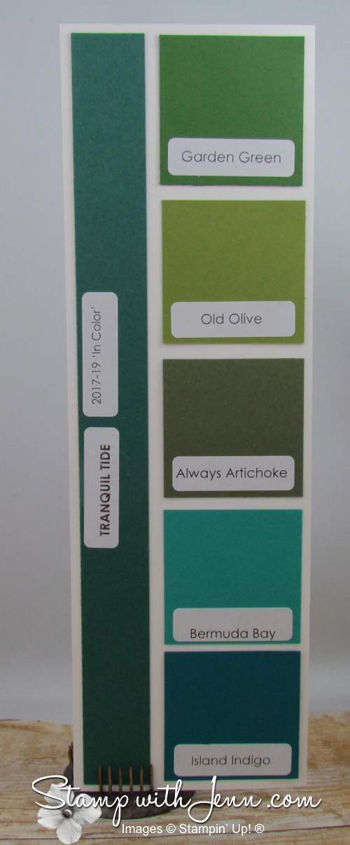
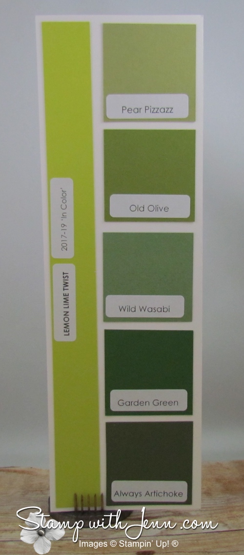
One of the things I always want to do is to compare these new colours to existing Stampin’ Up! colours, and I’m sure you are curious too. Where do they fit in? Are they lighter or darker? So I’ve made up these colour comparison blocks. These are only meant to compare the colours of a similar shade. These blocks are NOT suggestions of what I would pair together on a card making or scrapbooking project (although in some cases, it might work). Check out each comparison below.
Click on any of the images to see them larger.
Tranquil Tide is a deeper and bluer green than Garden Green and much more green than Island Indigo. I think of trees and Christmas when I see this colour.
Lemon Lime Twist is just like what the name says. It makes me think of lemons and limes and bright fun swirls and summer days. And I think it would look amazing with a dark colour like Basic Black or Night of Navy. It is yellower than any of our existing greens, but still is a green!

Powder Pink is a pretty and soft pink that is very close to Blushing Bride, but lighter than it. These two colours would look great together in a tone-on-tone card. Powder Pink also looks great with Sweet Sugarplum and with its fellow ‘In-Colors’ Berry Burst and Fresh Fig.

Berry Burst is a cross between a purple and a pink and very luscious looking. When I first saw it, I think it might be similar to Melon Mambo, but as you can see from this colour comparison, it is much deeper and more purple in tone. Definitely one of my favourites.
Fresh Fig is the darkest of the new ‘In-Colours’ for 2017-2019 and it is a rich purple colour somewhere in between Perfect Plum and Rich Razzleberry, but not as dark or as purple as Elegant Eggplant. “Fig” is the perfect descrption for this colour.
I hope you enjoyed my colour comparison blocks. Leave me a comment below and let me know which is your favourite new ‘In-Color’ of 2017-2019 Collection. If you would like a copy of the new Stampin’ Up! Catalogue, please fill out my form here.
 Be sure to tune into my blog tomorrow at www.stampwithjenn.com where I’ll have some cards for Simple Saturday post that feature these new ‘In-Colors’.
Would you allow posting on Pinterest? I stamped some comparisons but I like paper and the way you did it sooo much better.
Thanks Trish for the compliment. I’ve already got these pics on pinterest that you can pin. Just go this board: https://www.pinterest.com/stampwithjenn/stampin-up-in-colors-2017-2019/